Noventis IT
How we built a visual identity for a new IT and staffing firm that had to look established on day one.
IT & Staffing
Visual Identity Creation
Role
Logo, Brand Identity & Brand Guidelines
Timeline
8 weeks
team
Brand Strategist & Designers
platform
Print + Digital

Brand Identity Design for a New IT & Staffing Company
Noventis IT came to us with nothing but a name and a big plan.
They're a new Hyderabad firm offering professional staffing, executive search, payroll, IT project services and their own AI hiring platform, A.T.L.A.S. On paper, they could sit across the table from companies that had been doing this for decades.
The problem was that nobody would believe it yet.
In staffing and IT services, the client is trusting you with two things it can't afford to get wrong: its people and its systems. Before any proposal is read, the client has already judged your logo, your card and your deck, and decided whether you look like someone they can trust with that.
So the brief was really one question: how does a company that's months old look like it's been doing this for years, without looking like everyone else who has?
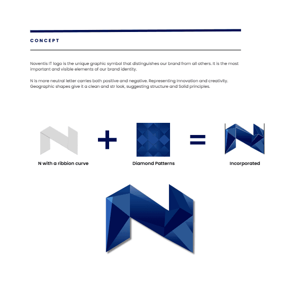
The Thinking Behind the Logo: Ribbon + Diamond
We chose the letter N for the mark, and that choice was deliberate.
N is a neutral letter. It carries both directions, up and down, positive and negative, and it doesn't lean towards anything. That made it the right starting point for a company that sits between two sides: talent and enterprise, people and technology.
Then we worked in two ideas.
First, the ribbon. We drew the N as a single folded ribbon, one continuous strip that turns back on itself. It stands for what Noventis actually does: one unbroken line connecting a candidate to a company, a project to a team, a business need to the right person. No gaps, no hand-offs that drop the thread.
Second, the diamond. Diamonds are pure structure: geometric, precise and valuable because they hold their shape under pressure. That's the promise a staffing and IT partner has to keep: when the deadline hits, the system doesn't crack.
Ribbon + diamond = the Noventis N. We cut the folded ribbon into faceted, diamond-like planes in shades from deep navy to bright blue. The result has flow and structure at the same time. It looks engineered, but it moves. It feels like a premium mark rather than a template, which is exactly what a new firm needs when it's pitching against established names.

Colour, Typography & Pattern: Why We Kept the Blue
The easy agency move would have been to throw out blue and pick something loud. We didn't.
In IT and staffing, blue is trust. Fighting it would have cost a new company credibility it hadn't earned yet. So instead of running from blue, we made it ownable. Noventis doesn't use a flat corporate navy. It uses a blue gradient that runs from almost-black midnight to a clear, bright sky blue, with black and white for contrast. The gradient gives the brand depth, light and movement, the same qualities as the faceted mark. That range is what makes it the Noventis blue rather than a blue company.
Typography with a split personality, on purpose. The primary typeface, Balgin, is light, open and geometric, with a distinctive angled "t" that gives the wordmark its character. It feels modern and approachable, the passion in "Expertise Driven by Passion." The secondary typeface, Poppins, does the heavy lifting: Regular for body copy, SemiBold to ExtraBold for headings, Light and Medium for contrast. It's the expertise. Together, the type tells the tagline's story.
A pattern language built from one shape. The diamond carries through the whole system so the brand can fill a surface without stamping the logo everywhere:
Layered diamonds, overlapping outlines in shifting blues: many parts locking together.
Linked diamond chains, clean navy rows: structure, order and process.
Four-point sparkles, a diamond with curved sides, in soft greys and tone-on-tone blues: the human warmth.
Three linked diamonds as a signature divider and sign-off, used across documents and stationery.

Brand Collateral: Every Touchpoint Has a Job
We didn't design collateral to fill a checklist. Each piece was built around how a staffing and IT firm actually meets people.
Business cards that work in a recruiter's world. Recruiters and consultants network constantly, at events, in lobbies, over coffee. The front uses abstract diamond facets on white, so it's clean and premium without distracting from the name. The back gives the faceted N the whole stage, with a QR code so the contact can be saved to a phone in a second. Built for a digital-first audience, printed on 270gsm uncoated white stock for a premium feel.
ID cards and lanyards, because a staffing company's product is people. Every employee walks into a client office wearing the brand. The lanyard breaks the logo's facets into sharp blue diagonal shards, with a navy buckle and a clean N. The badge carries a softly faceted white background and a navy photo frame. Your people become the brand.
A letterhead that's never just paper. Offer letters, contracts and proposals are where staffing firms make or break trust. So the letterhead carries a huge ghosted N, the faceted mark faded almost to a watermark, flowing off the edge of the page. Even a plain offer letter feels like it comes from somewhere solid.
A 2025 diary that doesn't get left in a drawer. Corporate gifting is how B2B firms stay remembered between projects. A cobalt cover washed in the tone-on-tone sparkle pattern, "Diary 2025" in spaced caps, and the faceted N on the back like a seal.
Plus the full stationery set: a DIN C5 envelope and a branded pen, so the identity holds together from the first letter to the last signature.

The Problem: An Industry That Looks Like a Spreadsheet
We started by looking at the category, and it was a wall of sameness. Navy blue. A globe. Two hands shaking. An abstract swoosh. Stock photos of people pointing at laptops.
We understood why. These companies sell reliability, so they play it safe. But safe has a cost: if you look like everyone, you're remembered like no one. Noventis couldn't afford that. As a newcomer, it wouldn't get a second meeting on reputation alone. It needed the first impression to do the work.
Their own vision gave us the target. They wanted to be "both dependable and memorable." Most brands in this space manage one. We set out to design for both, so every decision had to pass two tests:
Does it feel solid enough for a CHRO or a CTO to trust?
Will they remember it after the meeting?

Digital, Brand Guidelines & What We Learned
Built for screens too. We tested the N as an app icon in light and dark versions, at the size of a thumbnail on a home screen, to make sure the facets stay clear when it's tiny. We designed a 12-icon line set: white outlined icons on navy tiles, with stroke weights matched to the pattern system. We also created social media templates in two modes, full colour for campaigns and black-and-white for events and thought leadership, so the brand stays consistent no matter who on their team is posting.
Then we wrote it all down. A 30-page brand guidelines document covers the logo concept, versions, clear-space rules (half the width of the mark on every side), the colour gradient, typography hierarchy, stationery specs, photography direction and iconography. It means Noventis can grow, hire, and hand work to any vendor, and the brand will still look like itself.
What We Learned
Trust isn't built by blending in. In staffing and IT, everyone thinks safe means trustworthy. It doesn't. You earn trust by looking like you know exactly who you are.
You can stand out in a category without fighting it. We kept the blue the industry trusts and gave it depth and movement no one else had bothered with.
For a people business, the brand has to be worn. A logo on a screen is an idea. A lanyard on someone's first day at a client site is a brand.
Launching an IT, staffing or B2B services company? See how we build brands or let's talk.